Budget Brussels
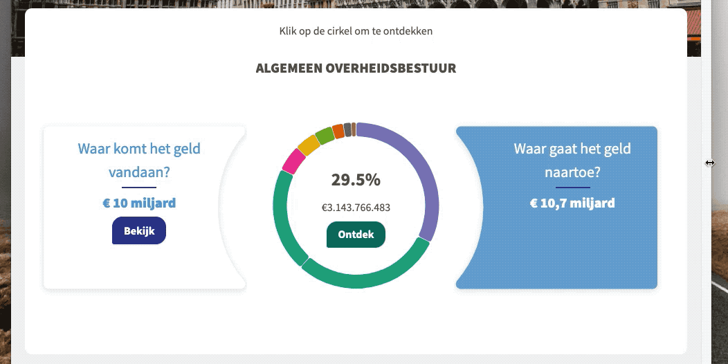
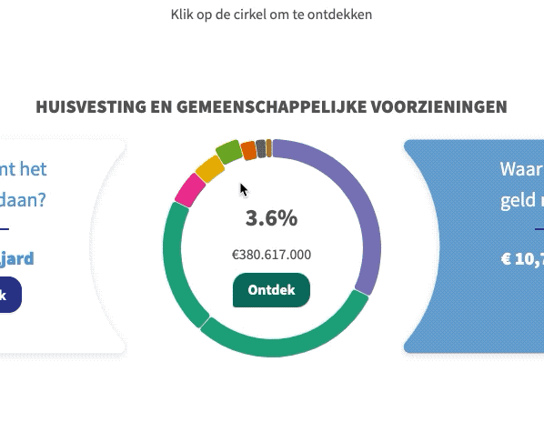
As a citizen of Brussels you have the right to know where the budget goes. Tree Company and Spaced came together to build the website framework. For the main visualization we developed a hierarchical circle. Fully zoomed out, you can see an overview of all the categories of the budget. When clicking a category you zoom in to a category, replacing parts of the site dynamically. Some categories have sub-categories, allowing you to zoom in even further.
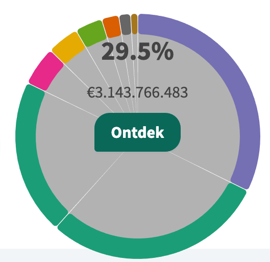
The challenge is the wildly different sizes of the categories. This means that zooming in to a circle would not work, because some parts would be too round, and other parts would be too flat. To solve this we “unfold” the circle, flattening out to the ideal curvature to show the category in question. The size of the unwrapping would depend on the category size. Seeing it zoomed out shows you the complexity of what’s going on:
Integrating the visualization with the rest of the site was a challenge. Thankfully there was a great partnership with Spaced, working together to get the right data using GraphQL within the Gatsby project. This was linked up to the Bpart platform, syncing themes and colors.
In summary, the site provides an engaging and informative way for citizens to explore where their taxes are being allocated. The novel use of a hierarchical unwrapping circle allows users to easily explore the budget, providing a better understanding of its distribution. Thanks to the combined efforts of various teams, we are proud to present a tool that presents complex data in an intuitive and accessible manner for the general public.
Credits
- Tree Company — project lead, back-end development
- Spaced — front end development
- Frederik De Bleser — visualisation designer